When Big Data Doesn’t Tell The Whole Story – Megaregions And Commuting
A study that was published in PLOS One today is a perfect example of how a data scientist typically works through problems in the clean tech space – together with all the associated complications.
The question that was asked in this study was this – “Can I use data about how people commute to understand which regions are economically dominant – that is megaregions?”
So, starting off at the beginning – why would this be a useful question to answer – or who cares about these megaregions? This is where some of the expertise comes in – understanding which regions are driving the state and nation's economy is useful in identifying economic policies that work, incentives that may be necessary to stimulate other areas and figuring out which regions are probably going to face the issues associated with more people moving there because of the increased economic vibrancy. Adding the commuting information changes this from a purely economic question to one about clean tech – how can cities and regions develop sustainable transportation strategies?
The scientists started off by collecting the data – all 4 million data points about commutes from two publicly available sources – the American Community Survey data from employees and the LODES (Longitudinal Employer-Household Dynamics Origin-Destination Employment Statistics) dataset from employers. And to see if there could be other relationships that could be teased out, they added data from the US Census, another public dataset.
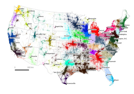
The first step in solving the problem was to look at the commuting data visually and do a quick statistical analysis on it. The results were pretty much what you’d expect – large cities and their surrounding areas were identified as the “Megaregions”. Then the question became – how much of the surrounding area should be included with the city? This is where the scientists used an approximate method that looked at relationship between the distance and the number of commutes and depending on how quickly the commuting data died away, the boundaries of the megaregions could be identified.
The figure above from the study shows how doing a quick analysis like this can help visualize information about the question being asked.
The next step then, was to see if there were finer details that could be teased out using algorithms. The base algorithm for this kind of analysis comes from Graph Theory and Network Analysis – one of the top 10 data science tools. So, graph theory was used to figure out which nodes (the large cities) were the most densely connected (had the most commutes). Or in geek terms from the paper “the problem of detecting and describing community structures within network data”.
The interesting thing that the scientists describe in their paper is that just throwing the data at the algorithm gave results that were weird and sometimes defied common sense. So, they added rules – things like removing cross-country commutes (you can’t commute from New York to Los Angeles), removing commutes from Alaska, Hawaii and Puerto Rico – since they aren’t connected to the mainland US….
That still didn’t give exactly what was needed – so, the next step was to play around with different conditions for the algorithm – for example, assigning different weights to how the nodes are connected, setting boundaries on the number of connector nodes and so on. This is fairly typical – as a scientist, you run different scenarios and see how changing the conditions changes your results and your insights. And then you can figure out what the bounds for all these parameters are – which ones make absolutely no sense, which ones are feasible and so on..
And this is where the expertise and knowledge of the subject comes in – how do you set these rules, these conditions and what are the key factors needed to solve the problem?