Communicating As A Data Scientist
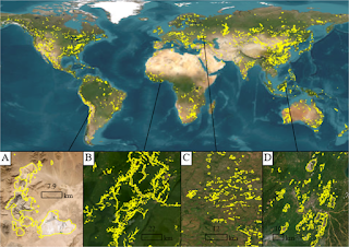
Wow, this has been a crazy week here in the San Francisco Bay Area! If a pandemic wasn’t enough, we now have over 300 fires burning in the area as a result of an unusual summer thunderstorm accompanied by lightning strikes.
It’s one of the aspects of climate change - that weather becomes more extreme. So, the western US and Australia as well as other areas see less precipitation, or precipitation that is unusual in amounts and timing, warmer temperatures. Thus, drier, warmer conditions that are ideal for these kind of extreme events become more prevalent - and hence, more disasters.
As professionals working in clean technology, we often get tasked with building the models for these systems, understanding what’s happening on the ground and developing new technologies to help solve these problems.
The one thing that many of us don’t really explore is the whole aspect of communicating the science and what the data are telling us. This aspect often gets relegated to science communications or public relations - but rarely do scientists get the lectures and explanations that talk about what goes into making these communications effective and useful.
And that’s something that’s really essential as data scientists working in energy, water, climate, agriculture, sustainability, disaster management or other clean tech sectors. The work here impacts people’s lives in very tangible ways - and being able to communicate what’s happening clearly and effectively makes it easier for the people who need it and for the data scientist working in the field.
As an example, let’s take a look at some communication from the wildfires happening in the San Francisco Bay Area this week.
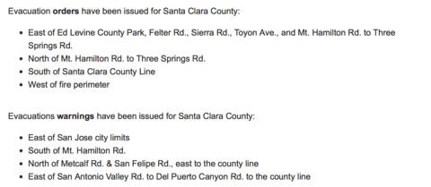
An important message the fire departments and fire analysts in the region are sending out is telling people when and where to evacuate. This is being done in a couple of different ways.
One is by specifying the roads and intersections by name and number. This is probably what the firefighters and other emergency personnel need to know and is most effective for them.
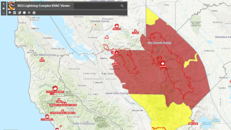
Of course, in both cases we have the exact same data that goes into the visualization - it’s just being shown in different ways for different audiences. And having one visualization instead of the other can impact what the audience sees and understands. And that’s just what data visualization is all about - how can you communicate your results, models and ideas effectively?
With all the open source tools and packages available these days, it’s easy to develop interesting, useful maps, tables, dashboards and reports. And that’s especially true when we’re talking about using Python for these tasks! While the first versions of Python used the library matplotlib for much of the visualization work, we’ve now got access to a stunning array of libraries and tools that let you build amazing visualizations - with only a few lines of code.